My diagrams maybe effect if they were designed in this way they are clear and simple.
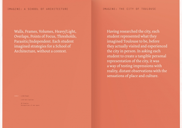
I want to keep the design of my print manual simplistic and easy to use, but I also understand that the content of my print manual is very text heavy I have been researching into different ways I can use the format of page to present text heavy piece of information. The key elements I can take from this and bring into my own work is to provide plenty of white space around the text so that the page doesn't feel cramped and also keep colour absent as this distracts from text or to keep the page is one colour + stock. I also think for the A5 format in which I will be working a one column layout would work best as two columns I don't feel is need and wouldn't make best use of limited space available.


Leave your comment