Use of mono typefaces could within the publications as they hark back to the user interface of the early computer, I want my publication's design to visual explain to the audience that it is specifically internet identity that will be explored in the publication.
The blurring and layering of type as well as repetition could reference the multiplicity of identity that I discuss within my essay as well as the many different versions of oneself that people make online.
Layering of images and type could also represent the the different versions of oneself that continually adapts and is constructed and changed.
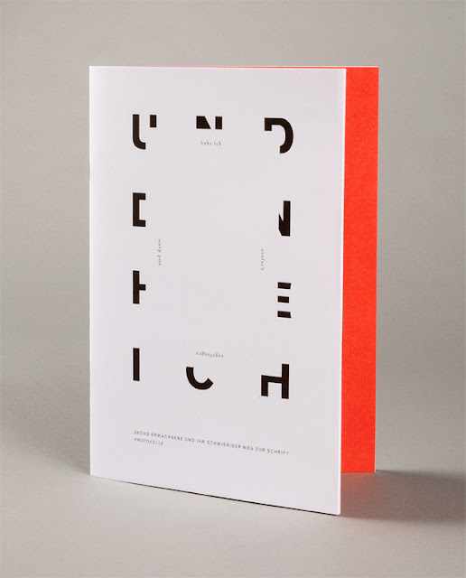
The covering of letterforms or abstraction of letter forms though hiding could be used to symbolise that an online identity is incomplete for the user of that identity as well as the person interacting with that identity.
I think the use of black and white within my publication could work well in creating a direct contrast between online and offline identity, they are two realms of identity, but grey could be used to show how these identities may overlap?
Examples of how the concertina format could be used.
Fragmented type and the confusion created by the abstraction of type can be used to visually represent the fragmented identity online and the many windows in which an internet user interacts with different profiles and persona's they have created online.


Leave your comment