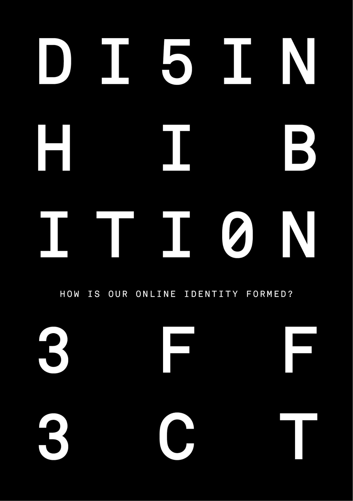
I have started to experiment with potential layouts for the pages of the concertina booklet, I have decided to use the black and white colour scheme which I researched into earlier in the brief. I think it works well in representing two types of identity, online and offline. Furthermore it provides high contrast. Additionally the use of numbers within the design is a reference to may target audience, as when my target audience grew up on the internet it was a 'trend' to use numbers in words when talking online, I have used this visual clue to make the publication relate to my target audience. It also makes the design appear more digital although it is still a printed document.


Leave your comment